We then decided to place the light on the left of the model so that half of her face would be dark and half light showing a contrast, which is similar in the contrast of personalities in the plot of our thriller. We went through a range of outfits that we looked, quite formal and glamorous and we decided to use a black or red dress. The black would represent the genre and its mystery and the red is often linked with blood and danger like the thriller genre.

 We began creating the look by doing the hair and make-up, we did the hair quite formal and pretty, as this is conventional for the type of magazine cover we decided to do. We decided on quite natural make up, but created the eyes a bit dark to make them look mysterious. After this we went on to taking the pictures, each member had a go at taking the photos; we tried from all different angles and had quite a collection. We uploaded the images onto a laptop and went through deciding which photos we liked the best and which we thought would work best on the magazine cover.

 We created different shots that were horizontal and vertical. We found with the horizontal ones that when making the magazine cover we would have a close up on the characters face. The close-up would take up most of the magazine cover and may over crowd the magazine with the other information we wished to add. The next variation was if we kept the flash on or off. The flash on pictures made the model very defined and had a large amount of detail, however it did not allow us to catch the light as we wished and did not create the dark contrast.


We decided to use a pose were the model was looking away from the camera; this was because it added mystery which links to the thriller genre. We decided that we preferred the black dress as it made the model look more grown up and added to the darkness of the image. We choose the image that created the halo of light around the character highlighting some of her features; also this image hides some of her features which make the genre apparent in the picture itself.

We then went on to editing the image; we did this in a programme called photoscape. We changed the levels of the; brightness, contrast and hue. Also we looked at the different effects the programme offered. However after looking at and testing out a few of the effects we decided that there wasn’t any we felt worked well for a magazine. We compared the edited version of the picture to the original and decided that we had edited the image too much as it had lost some of its depth and contrast, also the black had become a purple tone. Therefore we went back to the original and only raised the level of the contrast and brightness slightly.
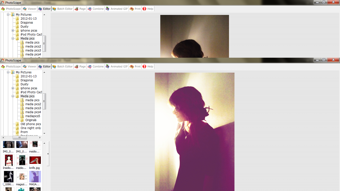
Whilst editing we noticed a dark line which was the lamp stand therefore we decided to get rid of the line to try and smooth out the back of the image and make the light look quite mysterious. We did this by using the clone tool; this allowed us to repeat an area. We tried to get the area as similar as the original, so that it would fit in covering the lamp.


 After this we went back to what we decided we wanted to include in the magazine cover. We started with the title, however we came across a problem the text on the photoscape programme would not extend to the size we wanted. Therefore we had to copy the edited image into paint then add a title using the text tool in paint. We came to realise that paint had give a white outline around the text therefore we had to edit this outline out using the pencil tool. We decided to crop the image in paint to the tip of the figures nose, this is because it will make it easier to line up when importing the image back onto photoscape. This idea worked very successfully. The rest of the text was done on photoscape as we didn’t need it to be too big. We decided to use a white font as it is simple and illegible to read, and on the most important parts of the magazine we used red. We decided on red as it is striking and represents danger; linking back to the thriller genre.

No comments:
Post a Comment