Thursday, 9 February 2012

Planning Magazine Cover;

We created mind map with different names of our magazine cover and what we would include on the magazine cover.


These possible names all were ideas of either the film genre of a thriller or because the magazine shows new and up and coming films. We decided on the name latest as it would fit with most genres, making it a wider magazine; which would appeal to a wider audience. The name was memorable and suggested new films.


We also made a mind map on the type of things we would include on the front of our magazine cover. This was thought of with the help of the deconstructions.

Deconstruction of Shutter Island Magazine Cover;


This magazine is clearly a film magazine which is the type of magazine that we will be creating a magazine cover for. The image and font link to the film well, and achieves the promotional purpose.


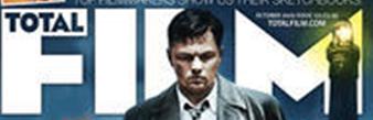
The first image shows the magazines title. This overlapping of the figures face is similar to the layout of the vogue magazine. This is an idea which allows the audience to see the importance of the figure. Here the word ‘film is written large with total in the middle. This is to show that the magazine is a magazine that is going to discuss films and introduce you to new films. The font is white, this is to contrast against the quite dark background, and also it helps make it eligible to the viewer.

The next image shows the title of the film; ‘Shutter Island’. The title is in the same font as it is in the trailer and poster. The font is red in colour, this makes it striking and represents danger, which is a popular element in the film genre; thriller. Also in smaller print is the name; ‘Leo’ this introduces the actor to the viewer. The movie title is large, but not as large as the magazine title this suggests that it is not as important, and maybe seen almost as a sub title.

This section shows an email dress even though in theis image it appears quite blurry, this allows the viewer to know where they can find extra information. This is something that we will consider including in our own magazine cover. This is because we think that it is important as it shows a form of contact from the viewer the magazine. The light in the corner almost seems to spotlight the magazine title.

The fourth section shows another film. This is also quite a modern film that was released around the same time. The genres of these two films are different, thus showing the variety that the magazine can cover. However the image they show is quite dark, which helps add to the mystery and suspense which is popular from a thriller.

The final section is the main image, this shows the figure as the character portrayed in the movie. The expression on the characters face is quite strict and almost aggressive; which adds to the danger conveyed in the genre. Also the eyes seem darkened on the characters face, which adds suspense and mystery which is popular of that genre. The surroundings around the character are quite dark and eerie.

Overall we found that this magazine links well to the genre of the film, whilst still showing the variety it covers. We decided that from the deconstructions we have made we found that it is important to link back to the genre, or it makes the film appear less important in comparison to the magazine.  

Deconstruction of Black Swan Magazine Cover;


This magazine cover is from a fashion magazine. However the film it is advertising is a modern thriller. Therefore it should help with the creation of our magazine. The magazine has quite a glamorous setting, as it the magazine is known for its fashion.


The first image simply shows the release date. This seems to be conventional for magazine covers. Therefore we will be adding it to our own. The text is very small as it is not as important as the rest of the text on the magazine cover. We shall include the release date in on our own magazine cover.

The next image shows the title of the magazine which has been overlapped by the head of the main figure, this gives the audience the idea that the actress is the main feature of the magazine. The title is a red colour which makes it quite striking, and contrast from the rest of the magazine. Also the title is towards the top if the page, which we have found to be conventional for most of the magazines we have looked at.


This is the main picture, and the importance of the figure is shown due to its scale. Also the figure being in the centre of the page; would make the figure become the first main focus. We have found that most of the magazine covers we have looked at have had the image in the centre. Therefore we will use the image in the centre on our own magazine cover. In this photo the figure is dressed in quite glamorous clothing, this to convey the fashion genre that the magazine has. Therefore it does not really link to the genre as much as it possibly should to promote the film.

The next section is a phrase which shows the actresses the name. Also the quote ‘expect the unexpected’, gives the idea of quite a mysterious plot and article. Also the description; most provocative role,’ allows the audience to gain a slight insight into the film and genre. Also it creates questions that the viewer will want advertising; therefore help achieve the purpose in promoting the film.

This section shows the text that is on the opposite side of the page. The text appears to almost frame the main figure, which we have found in the other magazine covers. This text does not really link to the thriller genre or link to the film in anyway. Our text will appeal to the thriller genre or movie as the magazine will be a film magazine.

Deconstruction of Insidious Magazine Cover;


We decided to include a horror magazine as it would, as it would allow us to compare with a genre that is so closely related to the thriller genre we have decided to use. This movie is a modern horror that is quite popular, therefore showing why there is a magazine cover for the movie.  The magazine Fangoria is a magazine which bases itself around horror films and gives you a look into what is coming out soon and an overview of the film itself.


The first section is of the magazine title. The magazine’s title is written in quite an edgy font this is to make it link to the horror genre. The sharp edges on the font make it look dangerous which is something often conveyed in a horror. The font is written in white this is to help make it striking and stand out against the dark background and shows a strong contrast which makes it noticeable to the reader, helping them remember it easier.  The font has a red outline around it this is because red is often linked with danger and blood. Also in this section is a phrase; “Italian Horror! American Horror! German Gore!” this allows the audience to see what the magazine is about and what it includes.  Also towards the top of the magazine is the issue number and release date of magazine, this is seen on nearly all magazines therefore it will be something we will include on our own.


The next section is an image of the character in Insidious, it shows the character in all its glory rather than just the actor which is seen in other magazines. This maybe because this magazine is aimed at introducing the reader to the film not just who is in it. The image is very dark which adds to the mystery of a horror. Also it adds suspense to the genre the magazine is aimed at. The candle which is in the centre, in front of the characters face almost spotlights the character. The characters eyes are still in the dark which will add a scary feel to the shot as you can not see the expression or emotion that maybe conveyed by the eyes.

The next image is the title of the film itself. This title is slightly smaller the magazines title this makes it appear slightly less important that remembering the magazine title. The font is the same that is used for the film title therefore adding a consistency for the reader so that they know what film they are talking about in th magazine.  Once again white is used as a contrast against the background and make it striking also in the title is the red once again to represent blood and danger.

The next section is the two pieces of writing that are around the image. These sections of writing allows the reader to know what else is being featured in the magazine.  They have continued the idea of using white and red font as they are striking against the background and help represent the horror genre. The writing all links to horror as they show elements that maybe seen in a horror like the danger and also they are names off other horrors that maybe similar to the Insidious.

The final section is advertising the free gift that comes with the magazine, this is used to appeal to the reader and to try again more readers by offering a gift. This is used as an advertising and selling technique.  The small images are to give the reader a taster of what they will be receiving.
Overall this magazine cover shows a good example of how the cover can link with the genre of the film it is showing.  Also it shows techniques that we may take into consideration when making our own magazine cover.

Deconstruction of Hangover Magazine Cover;


This magazine cover is for what appears the complete opposite to our film genre; thriller. We used a cover with The Hangover on the front this is because we could not find a magazine cover for Crazy Stupid Love as it is a very recent film. Therefore we though of another popular comedy which we found did have a few magazine covers to choose from. This magazine cover is to help give the group an idea what is needed on all the magazine covers. Also to see if there is any difference that may stand out to contrast against the genre.

The first section is off the title the bright orange and white that is used makes it appear to be quite a positive magazine. Also the roundness of the font makes it seem quite relaxing and simple. The font is overlapped slightly by the people on the front cover this gives you an idea that the title is not as important, as introducing the characters.  Also the light background makes the magazine appear quite positive and calming, this differs from the darkness and suspense which is created in the Fangoria magazine.


The next section tells you who the people on the front of the magazine cover are and why they are there; ‘The Hangover Bro’s’. This shows you what film they are from and the word ‘funny men’ shows you that the genre is comedy which relates to the humour of the magazine cover.  The font is consistent throughout the magazine cover.  Also the use ‘of the year’ shows the popularity of the actors and the film.


The next section shows the words ‘men of the year’, this once again shows the popularity. Also it may be seen as a persuasive device, this is because of the year may be an exaggeration therefore intensifying the phrase and make it appealing for the reader.

The next part shows other subjects that are covered in the magazine; this is to show the reader what they are getting themselves in for. The ‘what else’ which is included links to the positivity and the humour that is on the front cover. This will be something that we will take in consideration when making our own magazine cover.  The cover links to the genre well which is something with have seen in previous magazine cover deconstructions.


The last section is of the main image this introduces the character to the reader. This image differs from the Fangoria magazine as it shows the actors in a much more glamorous outfit rather than their character. This image conveys the genre of the film it is promoting, by using a quite humorous and relaxed pose. The expression on the actors is quite positive which creates a positive look for the whole magazine cover.

Editing Promotional Posters;


We then went on to create our promotional poster. We did another photo shoot, however this time we decided that we needed the actress in her character, and to make the photos eerie so that they link to the thriller genre.  We took a range of photos that deferred. Whether it was the angle, close up or with flash. One again we found that the photos with flash allowed us get a greater depth of detail. We used a dark surrounding and then used a small bright light to create a spotlight and highlight the character face. We found that when just highlighting the characters face, it created a mysterious look; also it darkened some of her features such as the eyes, which adds to the spooky nature of the genre. Also it adds suspense which is conventional of a thriller genre.


We decided that we would create a range of posters, as when we were researching other film poster we found that there were often different posters to choose from. The first poster we concentrated on was the main poster that would appear on billboards and would be the most popular of the posters. We choose a photo which showed quite a bit of detail in the face, this is to show the features of the character and her make her recognisable. We decided to crop the image and use a close up of only use half of the characters face as this would add mystery to the poster.  


We began to edit the photo, however because we were quite pleased with the original photo we only slightly darkened the image. This helped to highlight the bruises on her face, it also helped to create a black background, thus making the character stand out more.

After editing the image we then went on to adding the other features of a movie poster. We were going to do this on a programme called Poster Forge; however we found that we had much more control and options in using photoscape. The main feature being the title, we found that just like we had on the magazine cover we had to create the text on paint as the text on the photoscape programme would not become large enough. We added the text and then imported the image and lined it up on the original image. We found that the other text such as the quote ‘Did she realise...’ , the release date and other co-operation and production information, we could create on photoscape as we did not want these to be as big.


We then went on to adding the age rating we did this by inserting a 15 classification box; which we had created on paint and the imported, we then added the extra text which defined the classification, we added the text on photoscape because when we tried on pain the image would blur the text and make it harder to read. We also imported the image of our production logo this was to make the company recognisable and to show who had created it.


The next movie poster we created was quite simple; this movie poster is almost like a taster. The poster shows the release date and the quote; ‘Did she realise...’ This is to make the movie appear quite mysterious. Also the image we decided to use here is quite dark and eerie. Once again we had to create the text on paint then import as an image.  This poster will not be as often used as the first as it does not include all the information; however it is similar to other second posters we had researched for other films.


The next poster we created was so that we had a horizontal poster we could use when possibly advertising on bill boards. We decided again to keep this quite simple as we did not want it to be too distracting if it was going to be on large scale. It introduces the main character and shows the main title and release date. Thus showing all the necessary information. The image we used was one that we found quite eerie and scary.  As a group we decided that the image did not need much editing as the lighting we used creates the spookiness. However we did test out different effects and found that an effect called; ‘Cinema Middle’ created an extra depth and made the image appear slightly bolder.


The final poster we decided to be quite long in width this was so that we could advertise the film along the side of a bus. The movie poster we kept quite simple, we decided to only show the eyes, as this is where a lot of expression is shown also it once again creates mystery. We centred the eyes as they would then become the main focus and would help the viewer to recognise the character in other promotional features. We decided to add the red smoke behind the title this was to add the idea of danger; which is often associated with the colour.  Also it added an extra texture to the poster. Therefore we used white to contrast against the dark background to show a contrast and to become striking. 

We were happy with our posters as they looked quite professional and included all that is necessary in a promotional poster. However we were worried that our poster maybe confused with a horror genre, but these two genres are often confused and hard to tell the difference. This is due to the dark nature they both convey.

Planning Promotional Poster;

From deconstructing other movie posters we decided what was important and conventional for our movie poster and created a mind map listing this. By knowing these features we could create a successful movie poster; which achieves its purpose.