
This magazine is clearly a film magazine which is the type of magazine that we will be creating a magazine cover for. The image and font link to the film well, and achieves the promotional purpose.
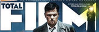
The first image shows the magazines title. This overlapping of the figures face is similar to the layout of the vogue magazine. This is an idea which allows the audience to see the importance of the figure. Here the word ‘film is written large with total in the middle. This is to show that the magazine is a magazine that is going to discuss films and introduce you to new films. The font is white, this is to contrast against the quite dark background, and also it helps make it eligible to the viewer.

The next image shows the title of the film; ‘Shutter Island’. The title is in the same font as it is in the trailer and poster. The font is red in colour, this makes it striking and represents danger, which is a popular element in the film genre; thriller. Also in smaller print is the name; ‘Leo’ this introduces the actor to the viewer. The movie title is large, but not as large as the magazine title this suggests that it is not as important, and maybe seen almost as a sub title.
 This section shows an email dress even though in theis image it appears quite blurry, this allows the viewer to know where they can find extra information. This is something that we will consider including in our own magazine cover. This is because we think that it is important as it shows a form of contact from the viewer the magazine. The light in the corner almost seems to spotlight the magazine title.
The fourth section shows another film. This is also quite a modern film that was released around the same time. The genres of these two films are different, thus showing the variety that the magazine can cover. However the image they show is quite dark, which helps add to the mystery and suspense which is popular from a thriller.

The final section is the main image, this shows the figure as the character portrayed in the movie. The expression on the characters face is quite strict and almost aggressive; which adds to the danger conveyed in the genre. Also the eyes seem darkened on the characters face, which adds suspense and mystery which is popular of that genre. The surroundings around the character are quite dark and eerie.
Overall we found that this magazine links well to the genre of the film, whilst still showing the variety it covers. We decided that from the deconstructions we have made we found that it is important to link back to the genre, or it makes the film appear less important in comparison to the magazine.

No comments:
Post a Comment